Monday 30 January 2012

Angela Carter's Folio Society - The Cover

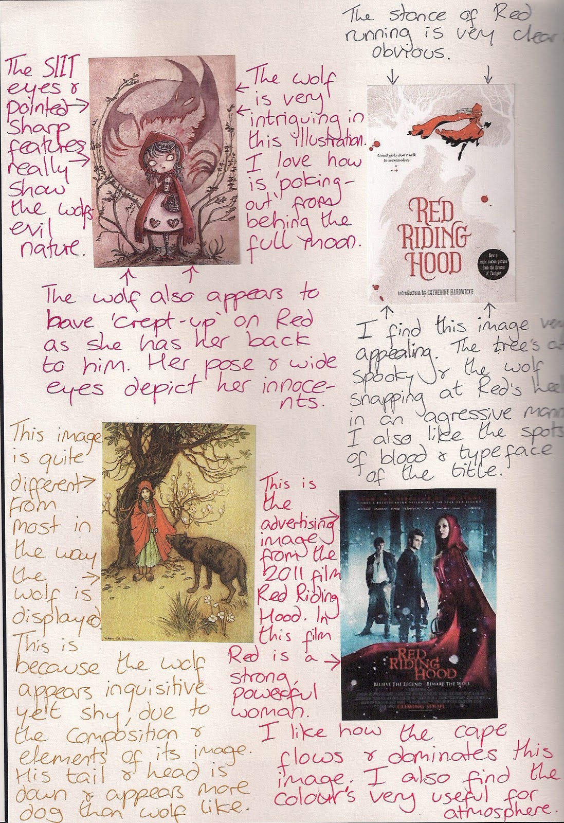
The cover for the Folio Society needs to be quite simple.  It could have been in black and white or preferably a limited colour palette.  The ideal binding is simple and graphic for printing onto or embossing the cloth in reproduction.


After the research came the ideas for which factors of the other illustrations I could use in the book cover:


I used the elements I wanted to include in this cover design (from the previous illustrations to see what they looked like together.  I like how they all fit together and appear to be a illustration for a story on its own.  The colours work and the trees seem to fit well, framing the image.  Its a shame that because of the restraints of the cover illustration that I will lose the detail through the fine colouring.


This is my final image for The Angela Carter's 'Bloody Chamber' novel:


I have decided upon this cover for The Bloody Chamber by Angela Carter.  The image is bold and has a limited colour palette as its being embossed onto material.  The orange colouring background in this image would be the orange of the material books cover and continue round to the spine and back of the book.  The spine would be where the title and author would be. 

It reflects the other designs inside the book, as it uses the same colour palette, composition of large and small objects as well as the potential for seeing this as having a sexual nature.  These elements and composition seemed to work well for the interior illustrations, so why not keep this continuity in the cover.


Angela Carter's Folio Society - The Company of Wolves

The Company of Wolves is originated around the story of Red Riding Hood.  These other Red Riding Hood illustrations I discovered are very interesting and inspiring as to what atmosphere can be created through composition, colour and media's are used.


From the research I took inspiration and created a few rough design ideas along the same idea of having the wolves eyes towering over Red Riding Hood.


From deciding upon the idea of the illustration, I picked apart the components to develop.


I created this tree through blowing ink using a straw


The drapery of Red's gown is very important:


Then I started to create quality components for the actual Company of Wolves illustration:

The background

The wolves eyes and nose

The twining trees leaving the shape of the wolves eyes and nose


The drapery of Red Riding Hood's hooded coat


This first design shows Red at quite a height, I like seeing the detail that I have painted into Red's drapery.  However, she doesn't seem to be towered over by the forest and the top of her hood seems to be interfering too close to the nose and start of the trees branches.


This is slightly better, with Red that little bit smaller it gives a nice space between her hood and the forest and wolves nose.  However, it could do with some more shrinking to create more suspense.


This Red Riding Hood is just too small, she definitely is towered over by the forest but when this is printed out at the correct size it doesn't show her enough and she needs to stand out a bit more as the illustration and story is about her relationship with the wolf.

Page 129

"The eyes of wolves shine like candle flames, yellowish, reddish ... the pupils of their eyes flatten on darkness"

This is my chosen designed illustration.  The size of Red Riding Hood is perfect for the atmosphere I am creating. It keeps in well with the series of two other illustrations with the large and small items arranged together, colour palette, as well as having the potential to be taken as possibly quite sexual, having Red entering a dangerous forest.

These designs may seem quite like fantasy illustration but that is the style that I am going for to reflect the origin of Angela Carter's inspiration.  It is quite a Gothic fantasy style and structure to the story, so to truly reflect Carter's dark underline to these original fairy tales I needed the illustration to reflect this.

Angela Carter's Folio Society - The Bloody Chamber

The Bloody Chamber is a incredibly visual story.  Angela Carter uses many historical characters, operas and artworks to refer to, to create atmosphere.  After researching the references she'd made, it gave a real theme and tone to the short story.  It was a feeling of grief, death, violent graphic brutality, sacrifice and drama.

Direct References from the story:


After analysing the story and direct text references came the initial rough design ideas then image referencing:


I prefer the idea of the car travelling to the castle so have referenced French castles, females fur coats and slick automobiles:


This then led to composition refinement:


So now I looked at a variety of compositions it was time to looks at media
Firstly I tried photocopy experiments, that then led me to photograms.  The photograms gave much more potential for creating atmosphere than photocopying:


So after looking at media for the car and castle I considered the actual shape of the car.
Going to a old car show in Tintern was where I took the following photographs


This particular image was very close to how the text described the car that the newly weds travelled to the castle in, esp in a silhouette form. This is the car that was my main form of inspiration:


MG Midget - British, 1960's
  • A nice silhouette shape
  • Sports style shape
  • Close to the suspected era
  • Clear clean lines
  • More accurate than other cars in fitting to the criteria


These are the illustrations I created to help create a final piece for the vehicle in the final piece:


Now to consider the sky background:


Then onto the Castle:
This completely illustrative book 'The Arrival' by Shaun Tan was of great atmospheric inspiration


I went to visit Chepstow Castle for a first hand look at what my castle could look like:


Atmospheric Photos:
These photographs Ive taken of Chepstow Castle are great at depicting the forms of the turrets and gates, but waiting for night time too come created some great atmospheric photos.  This was less documentary and gave the castle a real character.  This is created through the way the castle is lit up


After a lot of rescaling of the car this is the illustration I decided was best for Angela Carter's Bloody Chamber:

P.8

"And, ah! His castle.  The faery solitude of the place"


The purpose of this illustration is not just to illustrate the newlyweds journey to the castle, but also to give a suggestion to the tone of the story.

Sexuality in Angela Carter's stories are high up in the themes.  This image alludes to this.  The castle's turrets suggests a woman's legs and I'm sure you can guess what the gates and car represents.  I have also used deep reds and oranges, fiery colours which provide the feeling of lust, passion as well as bloody death.

Overall I am very pleased with the illustration.  It coincides with the themes I am creating between Angela Carter stories.  I'm doing this with my colour palette, media and principle of creating emotion and contrast with having a small item against a large one without much cluttering the background.  I will continue with the theme in the other images for Angela Carter.