Thursday 14 April 2011

My Easter Holidays

One illustration each day:
Ive decided to keep my imagination flowing by creating one illustration each day, either depicting what I have done that day or of an idea.  They may not be posted each and every day but they will be created once a day. Promise!!!
Hope you like them:

I get so nervous making that first mark in a sketchbook


I created this sketch ages ago on the Easy Jet (well more like "Scary Jet") flight to Germany:


This is an illustration of my little cousin Jaime, I was trying to bring out her fun, energetically crazy personality in this image:   
(09/04/11)


This is more of a doodle, I tried to combine the duck with its environment (the reeds and river) in a colourful pattern:  
(10/04/11)


This illustration came about from me spending HOURS regimentally tidying and organising all my clothes in my wardrobe.  Yes I did have 2 black bags of clothes to get rid of:   
(11/04/11)


For once an active day!!!  The Wii "Your Shape" with a web cam style device shows you what your doing, whist the animated wii woman shows you what you SHOULD BE doing :-)
(12/04/11)


A lovely shopping day out with my friend Ceri in Hereford inspired this illustration.  I just had to illustrate a New Look changing room scene (other changing rooms are avaliable) as we spent 1hr 30mins in this one shop getting kitted out for the summer:
(13/04/11)


Tuesday 5 April 2011

Ebook

The second part of the Illustration Futures project was to create an ebook.  I decided to do it as a children's short picture book about the creation & birth of an Emperor penguin chick.  I was highly inspired and learnt a lot from the film March of the Penguins.  Thus, that was my first port-of-call.

After making notes on the film I split it up into sections and then started to cut what wasn't necessary

Then from (happily) re-watching March of the Penguins to check I didn't miss anything out and could get a better feel of the film, I created these illustrations.  I love how traditional and aged the pencil lines make them look.


To make sure my thinking was on the right track, I created a 'Creative Synthesis' list on the problem:


Before starting to create idea's, I looked and reminisced on the successes of past penguin animations, and analysed why they were so successful in creating a connection with children.


A very helpful book to use with aiding an illustrator create successful work is:
This is where I learnt more about the physcology of composition:


THIS WAS THE POINT AT WHICH I DECIDED I COULD START TO DEVELOP SOME DESIGN IDEAS:


This then led me to start designing my characters from photo's I had taken in Berlin zoo:


The "Bloomsbury Guide To Creating Illustrated Children's Books" also was a helpful tool as it displayed examples and tools of ANTHROPOMORPHISM.  I created the following images with the tools I learnt from this research in mind:


I liked the strong, assertive lines that the Indian ink and biro created, as well as the soft and delicateness of the watercolour.  However, after developing these designs into being more fitting for a childrens book I decided upon coloured pencils.  Annotation surrounding the following illustration explains why:


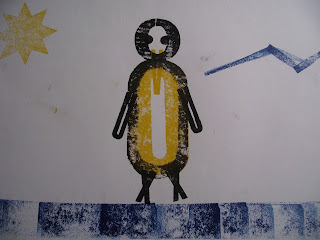
In the development of the characters I also experimented with typography and image.  I created the following images in the print workshop and am pleased with what I've achieved threw developing my outcomes:


 The second of the last 2 images was an improvement on the first.  With the first one, the beak (A) blends into the body too much and its not defined. So with the second i raised the beak up and away from the body, making it compositionally improved and clearer to see.


The last image I created in the print workshop was created using varying sizing lettering, placed in a certain way that it created a image using text.  This way of using type really interest me.